eSanjeevani
Redesigning India’s Telemedicine Experience
A UX case study improving accessibility, trust, and clarity in India’s national telemedicine platform — eSanjeevani.
Case Study
UX Redesign

What is teleconsultation?
Teleconsultation means getting medical advice from a healthcare professional remotely using technology like video calls, phone, or chat, bridging geographical gaps for check-ups, diagnoses, and prescriptions without in-person visits, often using smartphones or computers with internet. eSanjeevani is the Government of India’s national teleconsultation platform.
Why eSanjeevani?
52%
120k patients served everyday
165,000
health related apps available
1:25,000
physician-to-people ratio of rural india.
Active in every state across India
The Challenge
Universal healthcare in India faces barriers of distance, cost, and accessibility, especially in rural areas. While eSanjeevani aims to bridge this gap, usability and adoption issues limit its effectiveness, prompting a deeper exploration through design.
Research Phase
Discover
Using the existing application
I conducted a Think-Aloud session to document my first-time user experience with eSanjeevani.


Secondary Research
Insights from Research Papers
I reviewed research papers on telemedicine in India to understand its challenges. The insights highlighted issues of trust, accessibility, and adoption, emphasizing the need for human-centered design in eSanjeevani.
App Reviews by Users
App is not user-friendly.
Confusion about doctor availability, what does idle mean?
Unanswered calls.
Difficulty in entering and saving details.
Each added member requires a unique e-mail.
Some users reported the diagnosis being free as very good.


Audit
Existing Information Architecture

Comparative Analysis

Who's using eSanjeevani?


Define
I organized all identified pain points using affinity analysis, grouping them into four key categories (Features, User Experience, Digital Literacy & Context, and User Trust) to uncover patterns and guide focused ideation.
User Experience

User Trust

Features

Digital/Context Literacy

Action Priority Matrix

Key Insights
Unclear Doctor Availability
Users have no visibility into doctor schedules or availability during the consultation process, leading to confusion, wasted effort, and frustration when no doctors are found at the end.
Lack of Trust and Transparency
Hidden doctor qualifications, absence of visible verification, and uncertainty around data protection weaken user trust in both the platform and its medical authenticity.
No Follow-up Mechanism
The system lacks a structured follow-up flow, preventing users and doctors from maintaining continuity of care after initial consultations.
Inefficient and Uninformative Booking Flow
Users face dead ends and unanswered calls when doctors are unavailable, with no alternatives or waiting time information, resulting in a poor and incomplete experience.
Overwhelming and Unrewarding Process
The booking process lacks clarity, structure, and feedback, creating unnecessary cognitive load and emotional fatigue. Users don’t receive confirmations or clear progress indicators, making the experience feel uncertain, unrewarding, and demotivating, which ultimately discourages continued engagement with the platform.

How Might We? Statement
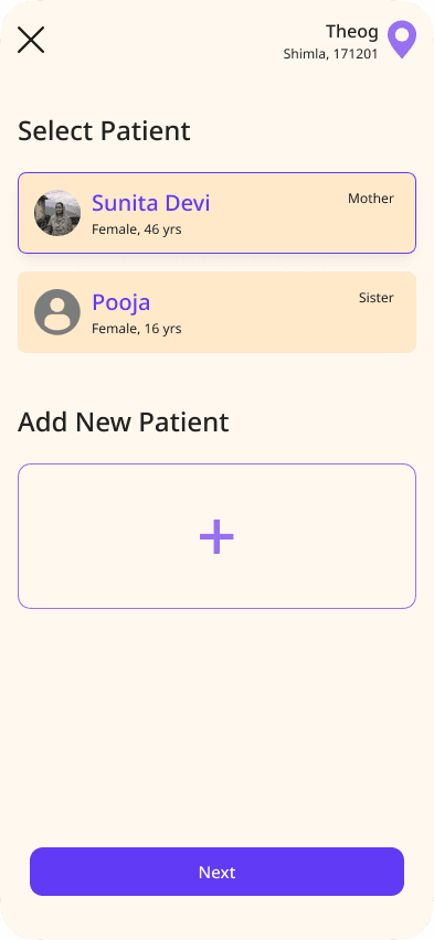
How might we create a simpler, more transparent, and trustworthy teleconsultation experience for users like Sunita Devi, who have limited digital literacy and rely on eSanjeevani for accessible healthcare; ensuring they can easily find available doctors, trust the system’s credibility, and complete their consultation journey confidently and without confusion?
Ideation for a solution
Design
Doctor availability with time shall be highlighted while selecting region/area itself.
OPD timings chart shall be displayed on the dashboard for patients to refer anytime and proper notifications for changes in OPD timings.
Show the nearest and earliest available doctors directly on the dashboard, so users can check availability without completing the entire booking flow.
Overwhelming and Unrewarding Process
The booking process lacks clarity, structure, and feedback, creating unnecessary cognitive load and emotional fatigue. Users don’t receive confirmations or clear progress indicators, making the experience feel uncertain, unrewarding, and demotivating, which ultimately discourages continued engagement with the platform.
Design Goal
To reduce cognitive load and uncertainty, improving user confidence and satisfaction through consistent, reassuring feedback.
Booking process needs chunking into sections, indicating progress, having clearly defined steps and actions, so that it isn't overwhelming or long.
Options to either schedule a consultation or have an instant consultation shall be available (based on doctor availability)
After entering details such as medical history, symptoms etc. patient shall be asked for confirmation, post which only shall the booking flow move on to the next section.
Provide clear feedback and confirmations for actions like form submission, profile creation, and appointment booking.
Inefficient and Uninformative Booking Flow
Users face dead ends and unanswered calls when doctors are unavailable, with no alternatives or waiting time information, resulting in a poor and incomplete experience.
Design Goal
To reduce friction and user abandonment, creating a smoother and more informative experience throughout the booking process.
Allow users to reserve a consultation slot for the next available doctor when none are currently available.
Include a self health check feature powered by AI or chatbot assistance, allowing users to start with an initial self-diagnosis through chat, voice, or file uploads before consulting a doctor.
Guided onboarding for first time users, informing them about the app through scaffolding.
No Follow-up Mechanism
The system lacks a structured follow-up flow, preventing users and doctors from maintaining continuity of care after initial consultations.
Design Goal
To strengthen continuity of care and improve patient outcomes by keeping both parties engaged and informed post-consultation.
Timely notifications (SMS, app notifications) for follow-up.
Doctor should be able to set up a follow-up meeting from their side as well, after a consultation
Have doctors enter diagnosis, prescriptions, and next steps in plain language, shown to patients after the consultation.
Lack of Trust and Transparency
Hidden doctor qualifications, absence of visible verification, and uncertainty around data protection weaken user trust in both the platform and its medical authenticity.
Design Goal
To build user trust and credibility, making the system feel transparent, reliable, and secure for first-time and recurring users.
Highlight success stories, doctor’s messages and government health updates to build trust.
Display doctor’s qualification, exp., and specialization besides their name and photo, to reinforce that all doctors are verified govt. professionals.
Prescriptions should be verified and stamped by the concerned doctor, for trust.
System Recommendation: Awareness campaigns and first time onboarding by visiting villages and rural wards.
Re-worked Information Architecture
Design


Wireframing Ideas


UI
UX4G 2.0
The redesign was developed using the UX4G 2.0 Design System, a standardized framework created for Indian government applications and digital initiatives, ensuring consistency, accessibility, and compliance with official design guidelines.


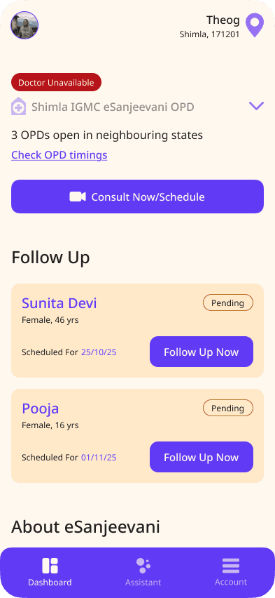


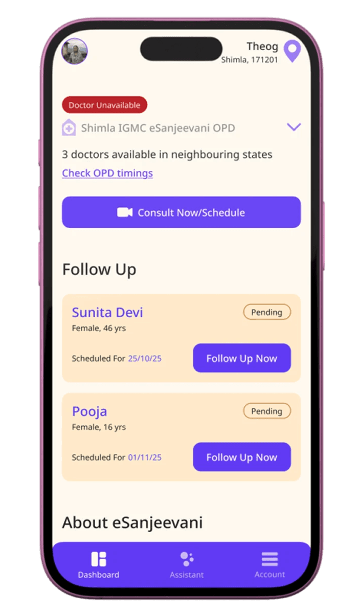
The dashboard highlights unavailability, suggests nearby OPDs or neighbouring states if there's availability, and provides a ‘Check OPD Timings’ button for scheduling convenience.

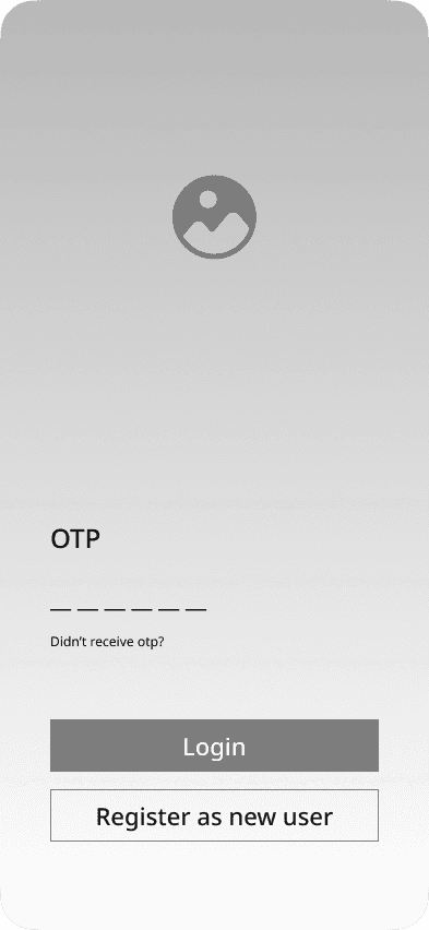
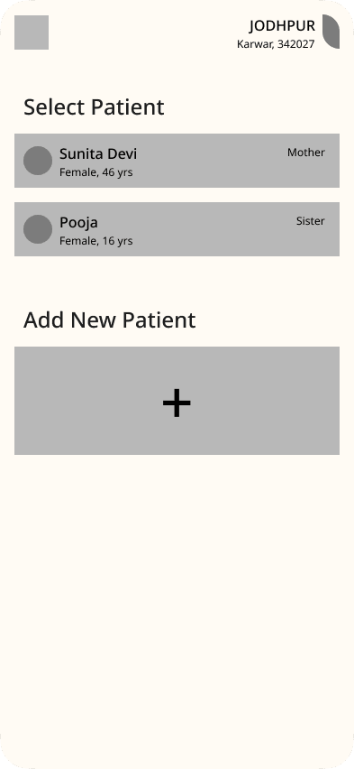
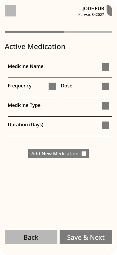
Booking Consultation
Doctor Selection Transparency
Users can view and choose doctors based on experience, specialization, and preferred language, making the process clear, credible, and trustworthy, addressing Lack of Trust and Transparency.
Consultation Scheduling
Users can schedule consultations for a later time, with updates sent to both doctor and patient, ensuring a smooth, informed, and flexible booking experience; addressing Inefficient and Uninformative Booking Flow
The Prototype
Usability Testing
Ease Of Use

Confidence & trust while using app

User satisfaction rating
Users reported clearer icons,
simple navigation and language.


